Well, since this is a behind the scenes blog (ha!) I thought maybe I should actually show how I work sometimes. This is also sparked because I just did a demo for my mom's art class last week. O.O I can't believe I'm two years out of college already!
ANYWAY, since the demo was about my layering technique and I used my six of cups card as an example, I figure I can show how that came into being. Starting with the sketch stage.
Okay first things first, research. Tarot is complicated and has meaning stacked on top of meaning. So TO THE INTERNETS! This
page and this
page are great resources for learning about tarot and their imagery. Also note important colors, people, animals, scenery, etc.
After I've gotten a good idea what this particular card is about, on to thumbnailing. Seriously, I never learned the value of thumbnails until the very end of college. I did 11 thumbnails for this one card. Sometimes I only need about 4, but this one gave me so much trouble. I use thumbnails to get all the "crap" in my head out on paper, it's there, I acknowledged it, moving on to something better.
Now, during thumbnailing I'm also looking for reference pictures. That's where Google Images is my friend. References are fun and irritating at the same time. You don't want to copy line for line, but sometimes it seems like nothing is working. This is why I like using LOTS of references.
A major inspiration for all my cups cards is Zena Holloway. She's ground breaking in terms of underwater photography and her images are just breath taking. Here I used this image as a reference for my boy, but notice just how much I changed.
Now here, there's nothing referenced except the mood. Children underwater, playful falling tea cups, light and happy.
I love this grotto print and you can see I took a lot of the scenery from this image. But the black and white only serves as a value study, I want color, thank you. ^.^
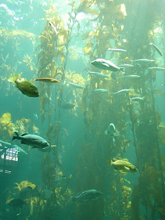
Reference for the fish and the kelp, maybe looking at color now, seeing how distance is applied underwater.
Okay, this one has many references. The little girl in the green shirt on the left, the blocks in the fore-, mid-, and background. Looking to change those ferns into coral, that kinda thing.
 |
| credit- no idea, it's in the depths of the internet. |
So, here's the first draft of the sketch. The first thing that changed were the size of my kids and that's the joy of Photoshop. Seriously, cut and re-size that shit, no need to redraw if you don't have to.
So to end, for now, with the "final" sketch.
The great thing about this technique is that it is not set in stone quite yet. In going to the next stage, I realized I still didn't like that fish at the bottom. So, I opted not to transfer it onto the illustration board and redrew it in the opposite direction to create a better composition.
Next time, sketch to illustration board and the "breaking of the white" underpainting. (that is, when I get around to scanning stuff.)


